Work
Services
About
Contact
All Projects
Brands
Websites
Publications
2GO 2020 ASR
ACRI
APEX Processing Corporation
BNI Elite
Century Pacific Food, Inc. 2022 ASR
Century Pacific Food, Inc. 2023 ASR
Century Pacific Food, Inc. 2024 ASR
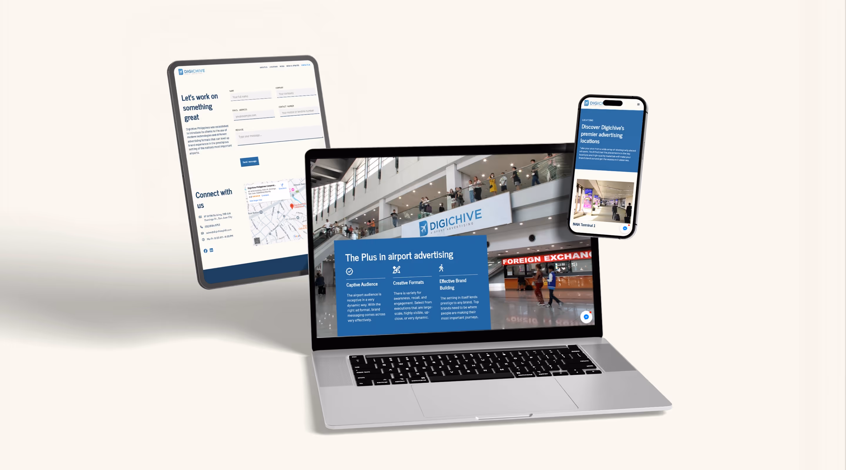
Digichive
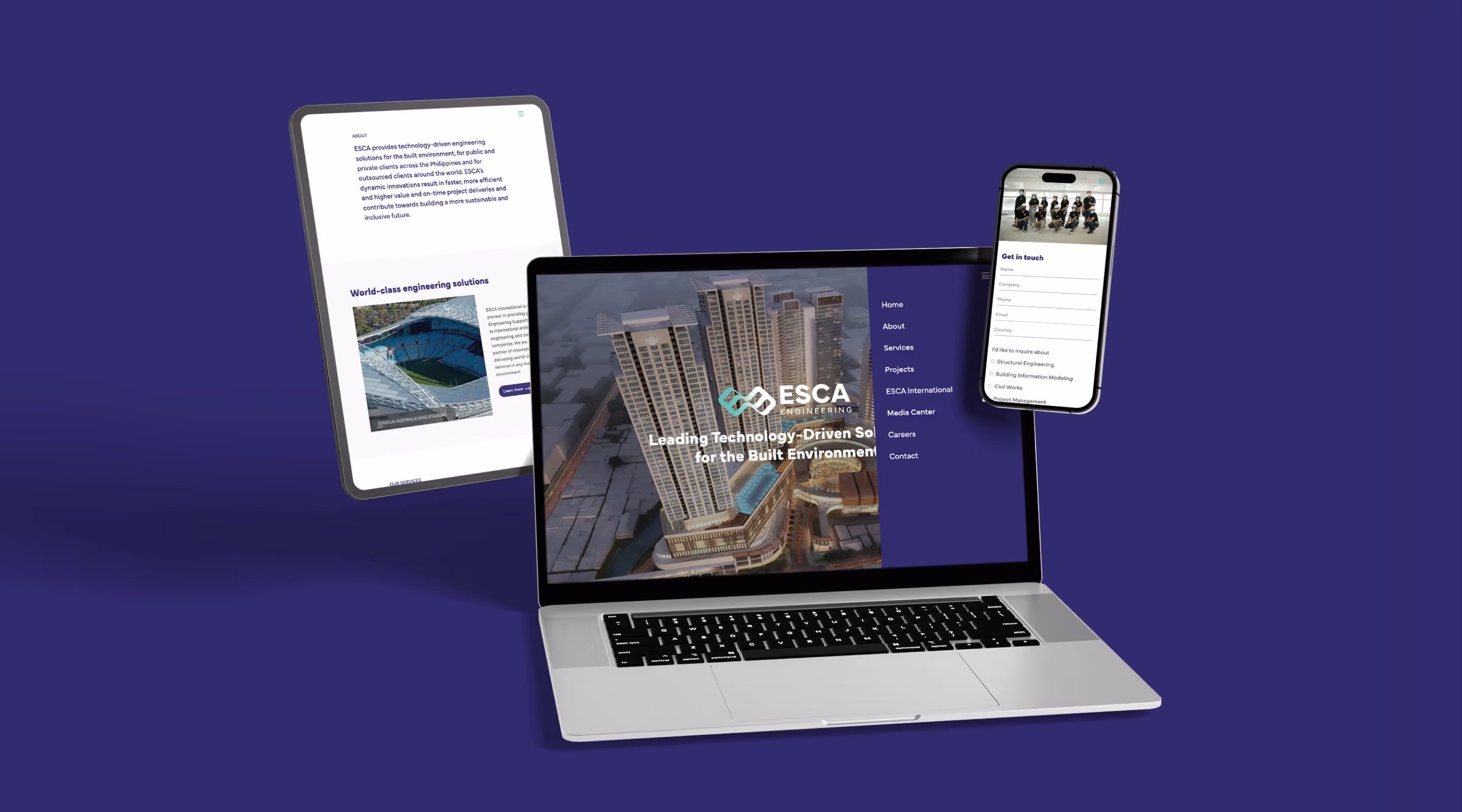
ESCA
Ellio’s Pizza
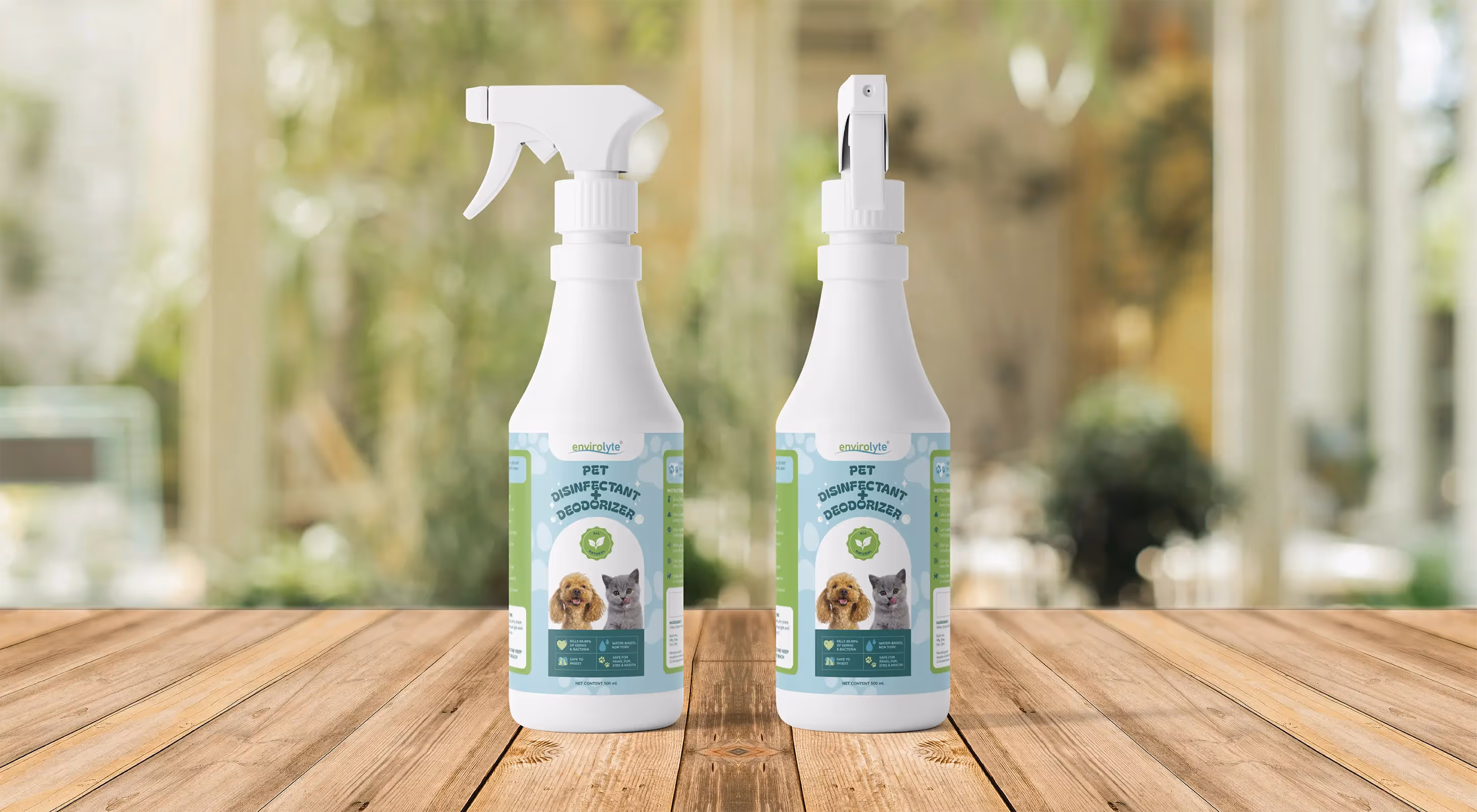
Envirolyte
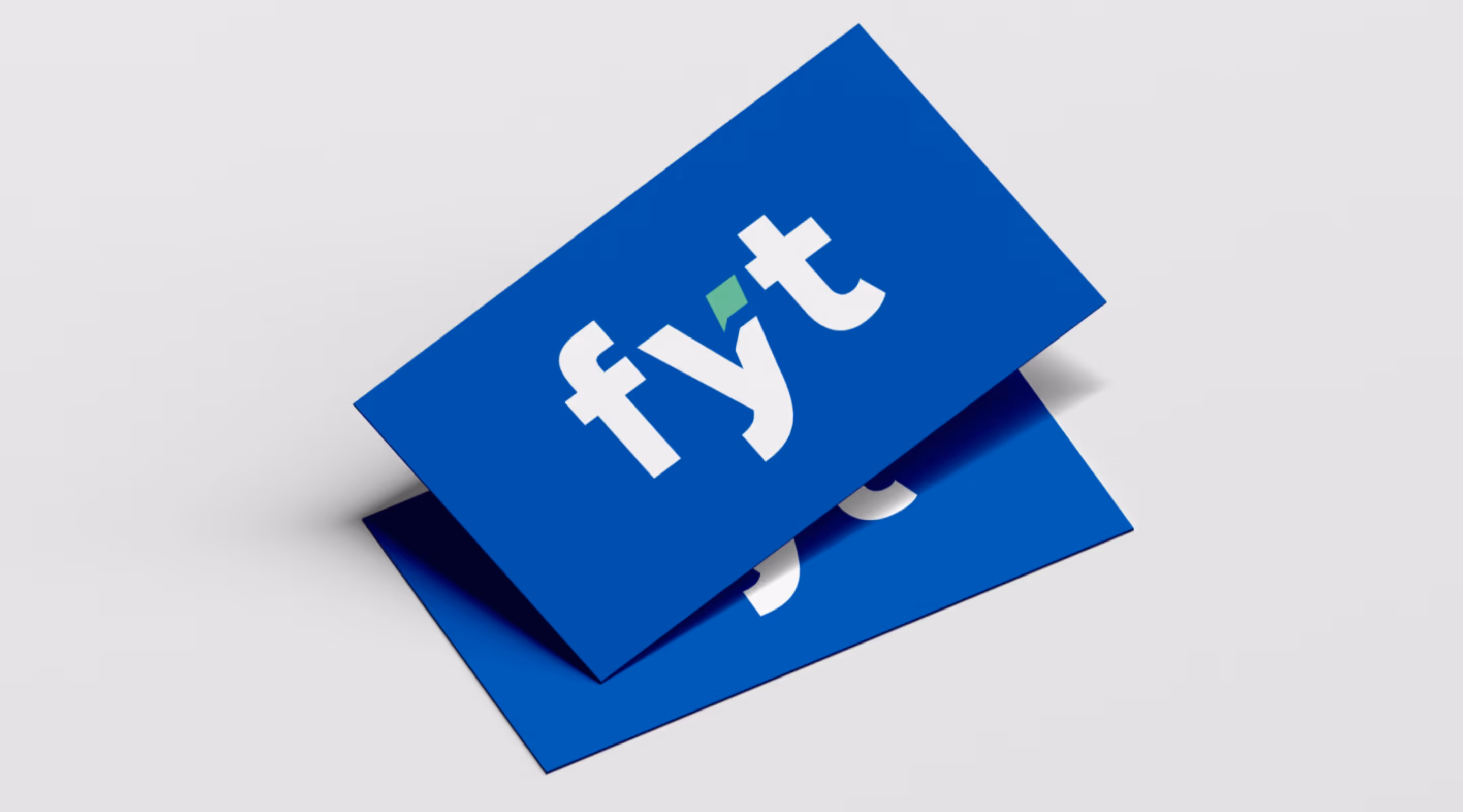
Fyt Media Group
Next
APEX Processing Corporation
ESCA
Fyt Media Group
Glo Bar
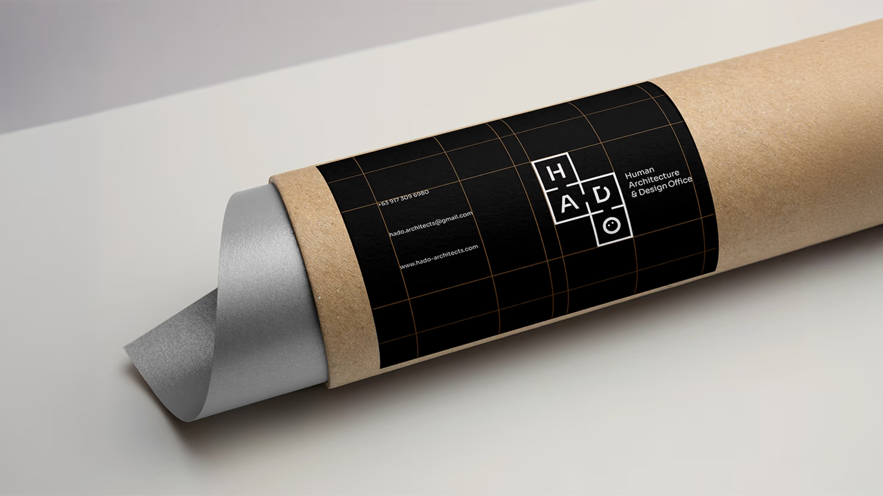
HADO Architects
Home Buddies
Ikinari Steak
Ride For Solidarity
Sodexo
Top 30 Leaders Philippines 2023
ACRI
Digichive
ESCA
Home Buddies
Ikinari Steak
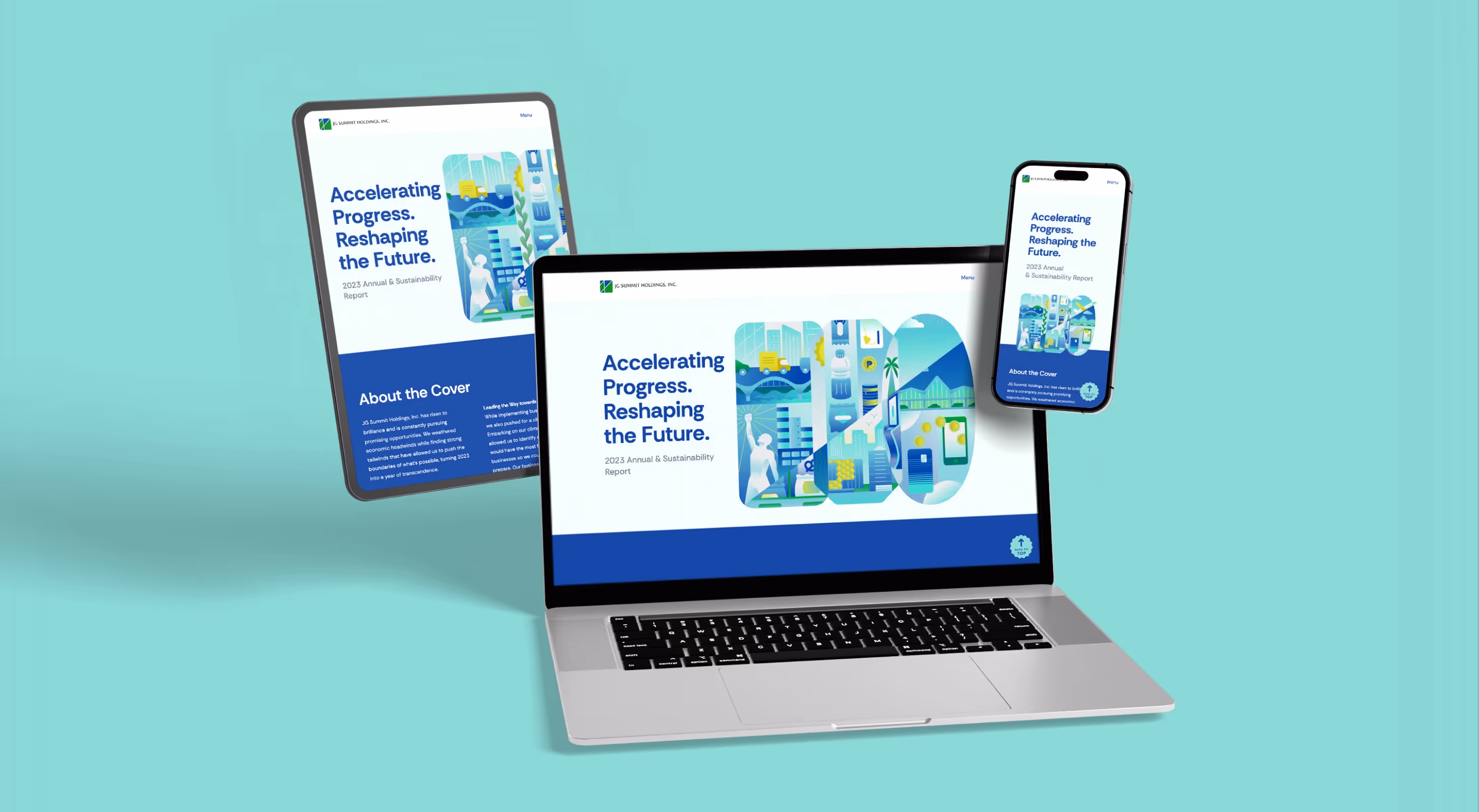
JG Summit Holdings, Inc. 2023 Digital ASR
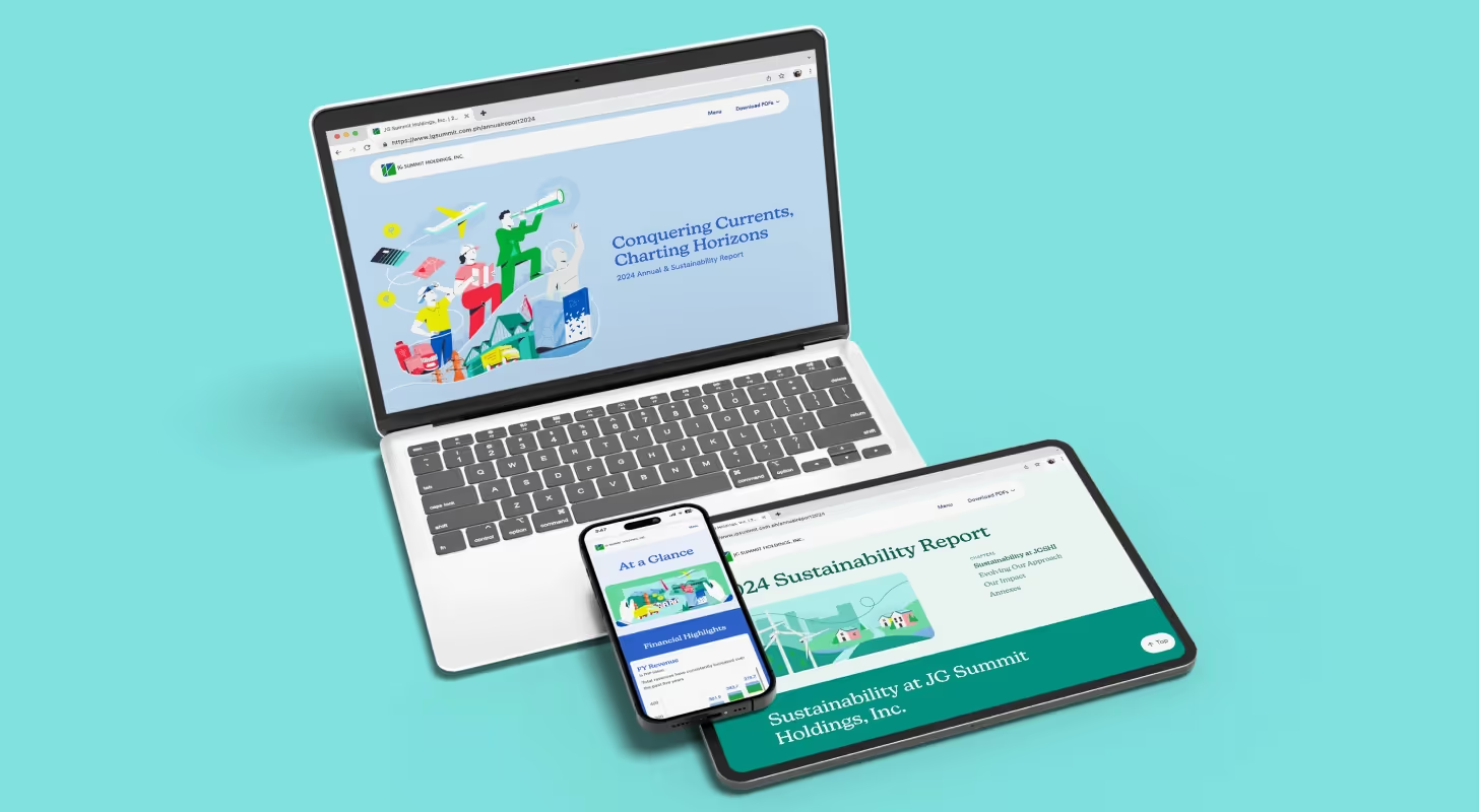
JG Summit Holdings, Inc. 2024 Digital ASR
Ride For Solidarity
The Nerve
2GO 2020 ASR
Century Pacific Food, Inc. 2022 ASR
Century Pacific Food, Inc. 2023 ASR
Century Pacific Food, Inc. 2024 ASR
JG Summit Holdings, Inc. 2023 Digital ASR
JG Summit Holdings, Inc. 2024 Digital ASR
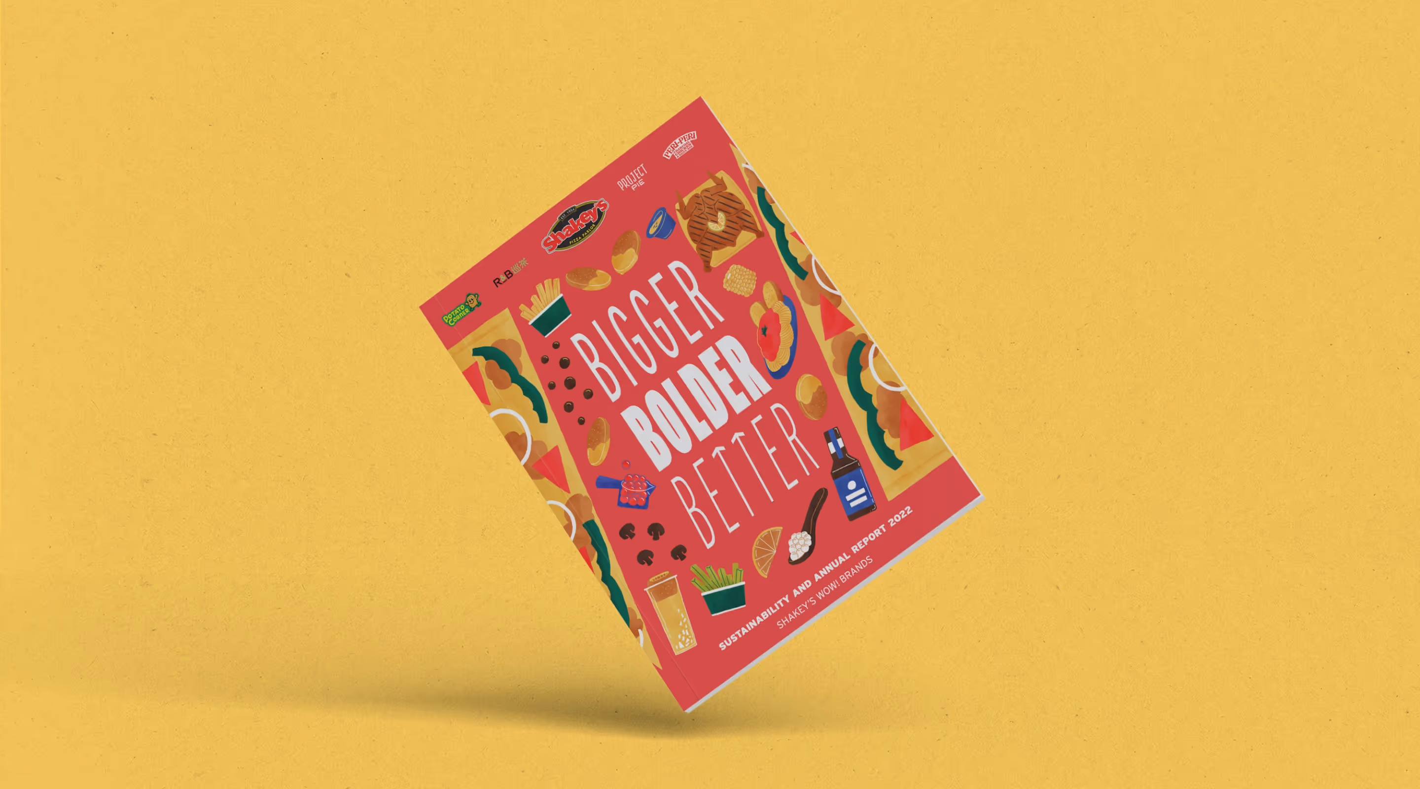
Shakey’s Pizza Asia 2022 ASR
Shakey’s Pizza Asia 2023 ASR
Shakey’s Pizza Asia 2024 ASR


.avif)